Hi, I am Solé Lisk!
I am a graphic designer based in San Francisco.

Architecture Series (2022)
This architecture series was created as a project for Design Fundamentals in order to familiarize myself with Adobe Illustrator. For this project I was only allowed to use 5 colors and photos from around campus that I had taken myself. This project uses very simple shapes and colors in order to create depth and dimension that would exist in the real world. This was a very simple and tedious project but displays the beauty in the architecture around us that would typically go unnoticed.
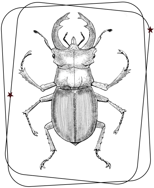
Entomology Sketches (2023)
This short series of drawings were done for fun. I think I have always been really fascinated by scientific depictions of bugs and I think by doing these drawings I am trying to manufacture a soft spot in my heart for bugs. While I do love them in drawing form I am not exactly in love with them in real life yet. Hopefully, eventually I will be!
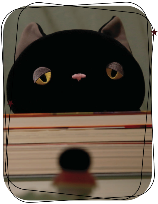
Photography Series (2022)
This photo series was created as a project for Design Fundamentals in order to familiarize myself with photography. This project was meant to be very personal and display all fundamentals of design. I decided to shoot photos of my stuffed animal in my bedroom in various positions and activities in order to capture each feature of design. There really is not an overall message to this piece in fact I actually used a nonsense generator for the caption of each image. I guess I could say I was inspired a lot by my tarot cards which I used to replicate the frame from each image.
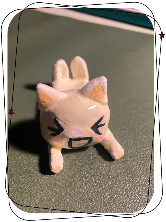
Toro Inoue Sculpture (2023)
I created this specific clay sculpture of Toro Inoue as well as other various small clay sculptures in my own free time because I wanted to explore art forms that were not strictly digital and were also more affordable and beginner friendly than pottery. For these designs and colors, I typically try to replicate something I see or am inspired by, but then it eventually becomes its own life form since I am still a beginner and things don't always turn out the way I imagined. However, it does add a very personal touch.
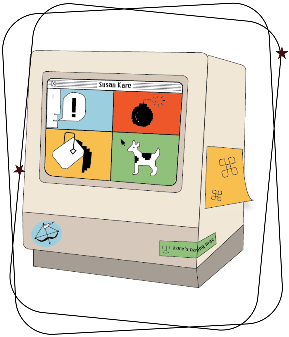
Susan Kare Icon (2023)
This icon was created as a project for Visual Communications I to highlight female designers. This icon highlights Susan Kare’s contributions to iconic design of the Macintosh computer user interfaces in the 80s. I was inspired by the warmth and humanity that Kare managed to bring with her simple yet innovative icons and bright bold colors to something so foreign and disconnected as a computer. I chose to incorporate the font “Chicago” which she had designed as well as four of her most well known icons and the colors she typically used.